
 News & Tips
Biggest Mistakes Businesses Make When Choosing Commercial Paint
As a business owner, you normally focus on running operations effectively but pay less attention to what paint colors you select for your walls.
Your commercial for walls paint decisions communicate key elements about your brand to others. People understand your business through how your space looks and feels, regardless of the specific environment it serves. Customers see it directly, while employees sense it and wrong decisions in color choice will cost you far more than you expect.
Companies often handle commercial painting tasks like quick personal projects, which ignore vital elements of durability, surface types, lighting environment and proper color choice. The result? The visible signs of poor painting reveal themselves through walls that peel and paint that doesn’t match, while odor and room issues damage workspace productivity.
Our guide explains the common errors in office painting made repeatedly and reveals solutions to prevent them. Let’s get into it.
Mistake #1: Choosing Paint Like It’s for a Home
Companies frequently choose commercial paint options that serve bedroom decoration but not commercial spaces requirements. The quality of paints used in homes cannot stand up to the persistent activity seen in commercial buildings.
Commercial locations require paint products that resist intense daily use plus easy cleaning and proper professional appearance. Walls in medical clinics need daily intensive cleaning. The ordinary sort of eggshell paint lacks durability, as it starts cracking and staining very fast so frequent touch-ups become necessary.
What to do instead:
Choose commercial paint with features like scuff resistance, anti-microbial properties (great for healthcare and food prep areas) and washable finishes that don’t fade. Examples includes Sherwin-Williams ProMar 200 Zero VOC and Benjamin Moore Ultra Spec SCUFF-X (perfect for high-traffic areas).
Mistake #2: Ignoring the Surface Type
Not every surface is created equal, and applying the same paint across multiple materials is a fast track to failure. You might get lucky initially, but down the road, expect chipping, peeling, or uneven textures if surfaces aren’t properly matched with the right product.
Different materials expand, contract, or absorb moisture differently. For example, concrete needs a breathable coating, metal requires rust-inhibiting primers and wood may demand a sealer and flexible paint. This is why it’s better to work with a painting contractor or product specialist who can evaluate the substrate type, recommend appropriate primers and the best paint for business spaces and ensure long-term adhesion and durability.
Mistake #3: Skipping the Mood and Lighting Check
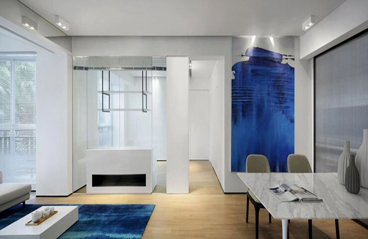
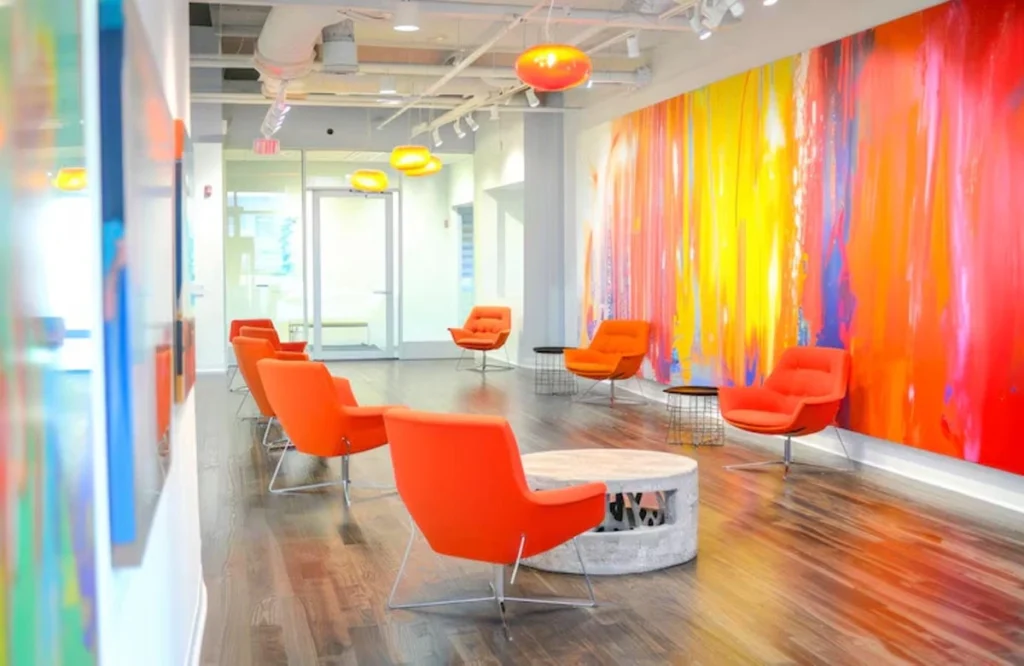
Too often, businesses pick colors based on trends, brand colors, or Pinterest boards—without testing how those colors actually look in the space.
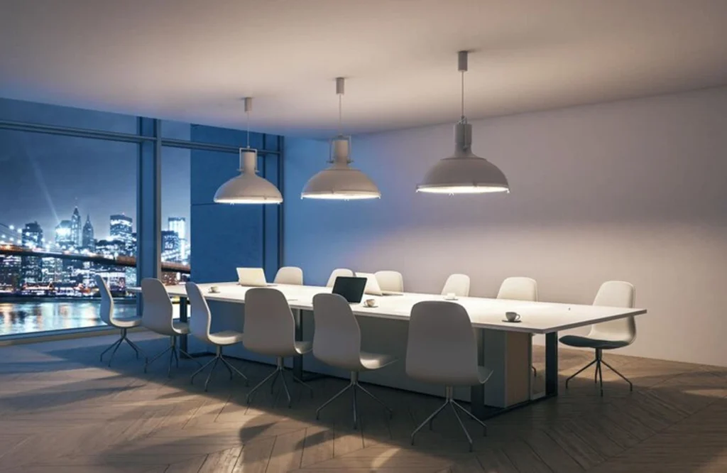
Commercial paint looks completely different under various lighting conditions. That energizing yellow might turn into a greenish hue under fluorescent lights. Or a sleek gray might look dull and depressing in a windowless office.
- Test large paint swatches on multiple walls and observe throughout the day.
- Factor in natural light, artificial lighting, and reflections from floors and furniture.
- Choose colors that support the emotional tone of the space (calm, energized, professional, inviting).
Moreover, it would be great if you use color psychology to avoid the commercial painting mistakes. For example,
- Blue promotes focus and productivity
- Green creates a sense of balance and calm
- Red increases energy (great for sales or restaurants—but not too much!)
- Warm neutrals offer versatility and sophistication
Mistake #4: Not Considering Lighting Conditions
The appearance of paint changes between office fluorescent lighting and sunshine because of LED light fixtures. The color that appears beautiful on display samples at the store can appear too bright or too pale when used on a large wall under interior lighting in offices.
What to do instead:
Put your test samples on wall surfaces to check how they appear at various times during daylight hours. Examine the colors under daily lighting as well as artificial lights. You should try out large paint areas for a few days before deciding which shade to keep. This is the only way to avoid one of the biggest commercial painting mistakes.
Mistake #5: Forgetting About Maintenance and Longevity
Large commercial areas sustain damage to their walls from regular furniture use and widespread markups. Businesses choose matte coatings for their visual appeal but realize they cannot be effectively wiped down.
Specific professional areas, including dining facilities and child care centers, must accommodate wall coverings that hold up to repeated sanitary procedures. A mismatch here means constant touch-ups or repainting every year.
What to do instead:
Consider the finish and durability as much as the color. In general:
- Flat/matte: low durability, hides imperfections, hard to clean.
- Eggshell/satin: moderate durability, easier to clean, ideal for offices and waiting rooms.
- Semi-gloss/high-gloss: high durability and simple to clean — ideal for kitchens, bathrooms, or high-traffic hallways.
Mistake #6: Trying to DIY or Hiring the Cheapest Contractor
Trying to save budget by working alone or picking low-cost contractors proves harmful because your work takes too long and looks low-quality. Affordable builders may work without valid insurance or business permits, which exposes your business to legal and financial danger in case problems arise with their painting services.
Professional commercial painters provide top-quality work while delivering more product options faster than both self-painted projects and low-cost contractors.
What to do instead:
Vet your painting contractor thoroughly. Ask for references, check insurance and licensing, and look for experience in commercial environments specifically — it’s a whole different game from residential painting.
Mistake #7: Not Getting a Detailed Quote or Timeline
Budget failure starts from the moment wrong cost estimates are used. Business spending increases suddenly for workspace arrangement activities and the purchase of necessary painting supplies.
Worse, an unclear timeline can delay operations, marketing campaigns, or new tenant move-ins.
What to do instead:
Ask for a detailed written proposal that includes:
- Labor costs
- Paint and material specifics
- Number of coats
- Surface prep
- Cleanup
- Schedule from start to finish
Review the scope carefully and clarify how unforeseen issues will be handled.
Final Thoughts
The best paint for business spaces isn’t just about the look—it’s about performance, professionalism, and longevity. Avoid these commercial painting mistakes, and your space won’t just look amazing—it’ll reflect the quality and care of your brand.
So before you grab a brush or hire the Service Hub for commercial painting, ask yourself:
- Is this the right paint for my space?
- Will it stand up to daily wear?
- Does it support my business goals and customer experience?
If you’re unsure, consult a commercial painting expert like Service Hub who can walk you through your best options—and help you avoid expensive do-overs.

Comments are closed